CASE STUDY · 2026
Screen Sage Studios
where spirituality, science and story collide.
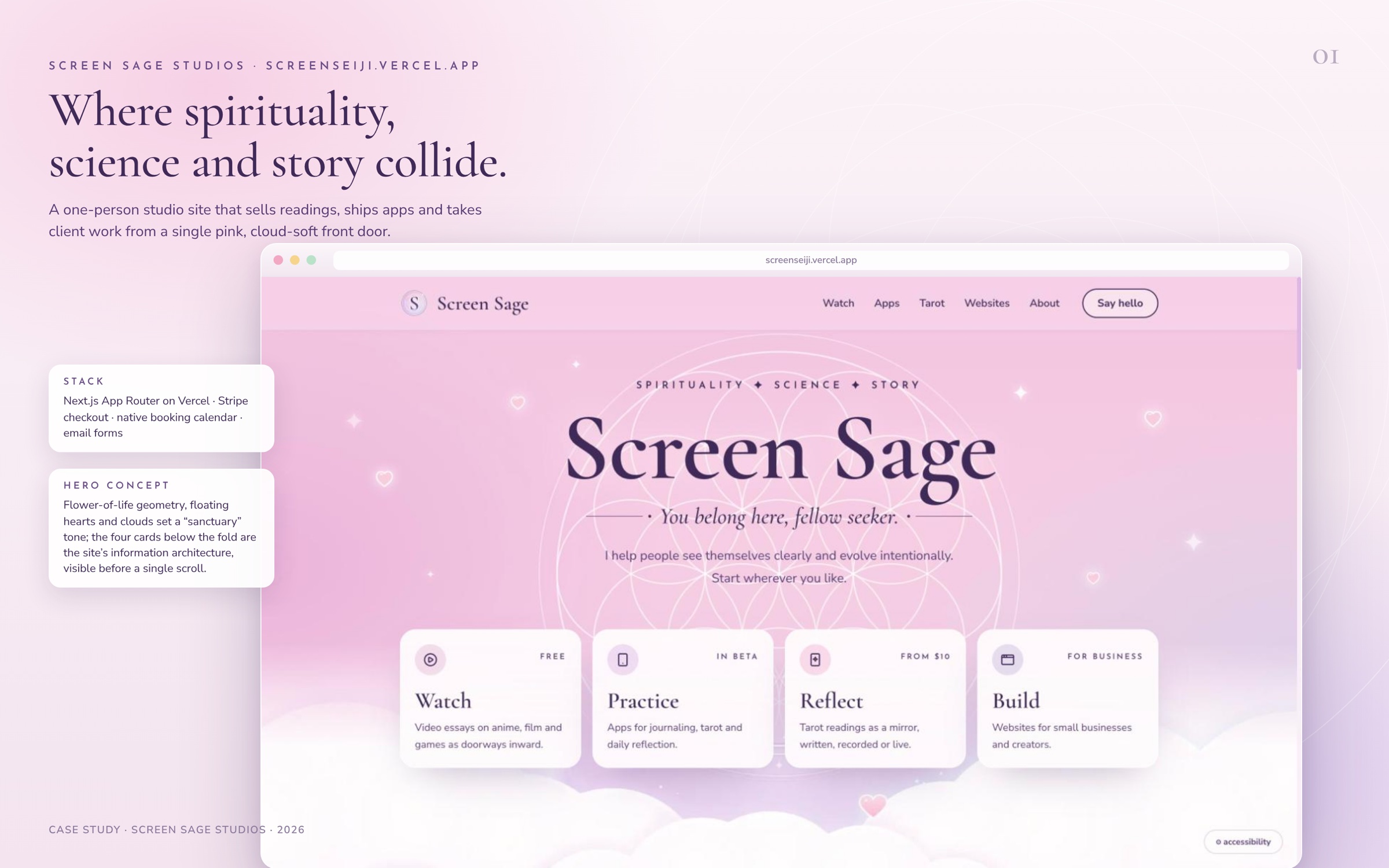
A one-person studio site that sells readings, ships apps and takes client work from a single pink, cloud-soft front door.
GLANCE.TXT
at a glance
Screen Sage Studios is a one-person studio that sells tarot readings, ships seven indie apps and takes on client websites. screenseiji.vercel.app is the front door for all of it: one pink, cloud-soft page that sorts four very different audiences in a single glance, then hands each one a real product with a real price.
The site is also the studio’s own proof of work. The Websites page lists “The site you’re on” as a portfolio piece, pointing at the native booking calendar, Stripe checkout and email forms a client could buy.
BRIEF.TXT
the brief
One person, four businesses, one URL. Screen Sage grew out of an earlier channel (Omniversal Seeker and the Seeker’s Soliloquy podcast) into a studio with video essays, paid tarot readings, a growing constellation of apps and a web design practice for small businesses. Each of those has a different visitor with a different question.
The constraints were the interesting part. No team, so every feature has to be maintainable by one person late at night. No budget for SaaS booking or e-commerce tools, so payments and scheduling had to be built in rather than embedded. And the brand sits at an unusual crossroads (tarot, anime, Buddhism, quantum physics, VR) that could easily read as either too mystical to trust with money or too technical to feel like a sanctuary. The site had to be warm and credible at the same time.
- ROLE
- Founder, product, design, engineering, copy (solo)
- STACK
- Next.js (App Router) on Vercel, Stripe Checkout, custom booking calendar, email-backed forms, Google Analytics
- AUDIENCES
- Viewers (video essays), seekers (apps), clients of readings (tarot), small businesses (websites)
- PAGES
- Home, Tarot, Apps, Apps/Arcana, Apps/Anicca, Websites, Side Quests, About, Privacy, Sanctum
- TYPE
- Cormorant Garamond, Nunito Sans, Josefin Sans
- PALETTE
- Plum#3F2A58Violet#593D75Lilac#6A4D86Blush#F6CDE3Paper#F8F0F6
INFORMATION ARCHITECTURE
four doors, one visitor
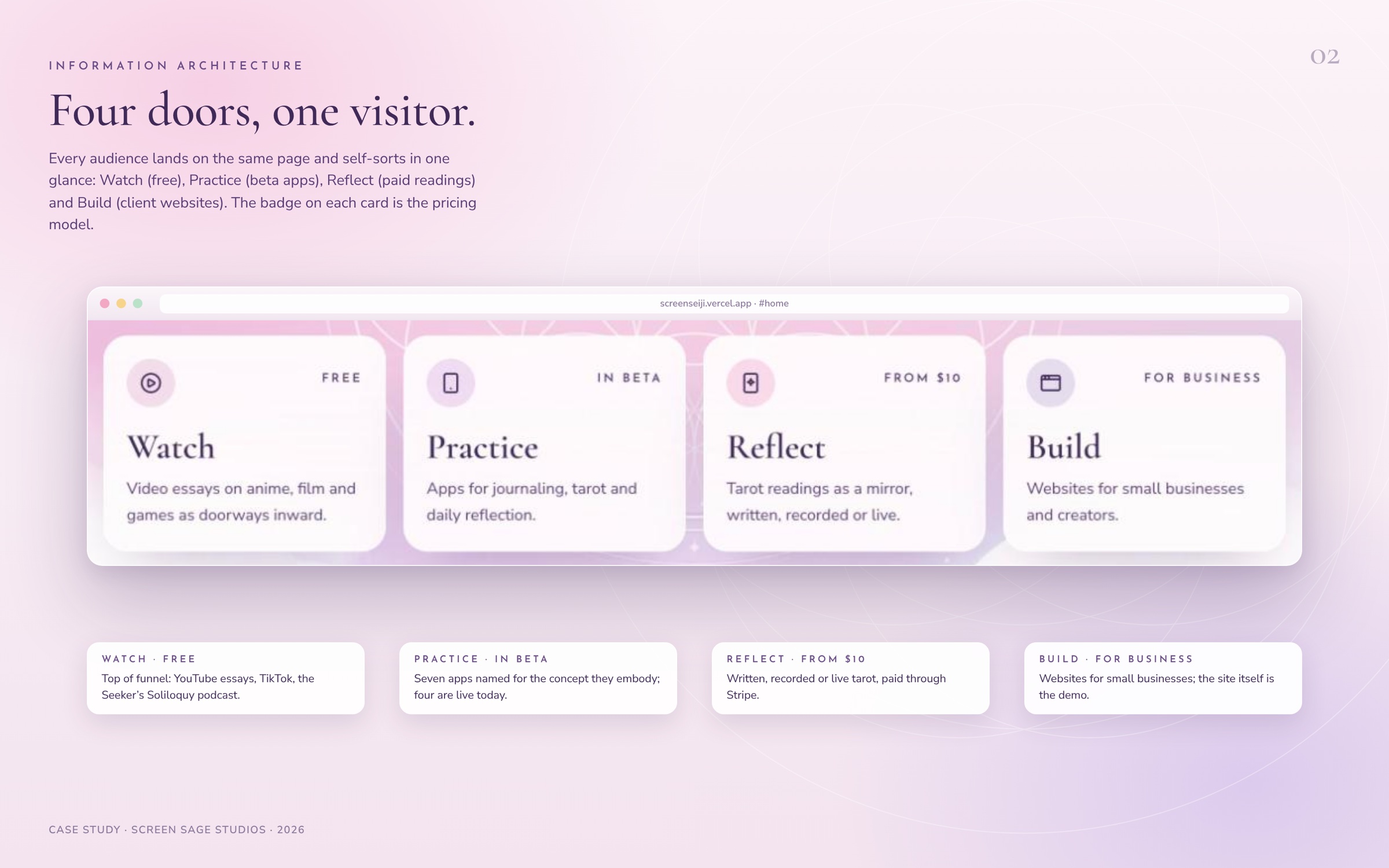
The whole site is organized around four verbs that sit directly under the hero: Watch, Practice, Reflect, Build. Each card carries a tiny badge that is really the pricing model (Free, In beta, From $10, For business), so a visitor knows what kind of transaction they are walking into before they click.
| Visitor | Arrives wanting | Has to leave with |
|---|---|---|
| A viewer from YouTube or TikTok | More of the philosophy and anime essays | A subscribe, a podcast link, a mailing list signup |
| A seeker curious about the apps | Something to try today | A TestFlight or WebXR link, or a waitlist spot |
| Someone who wants a reading | A clear price and a way to book | A Stripe checkout or a confirmed live slot |
| A small business owner | Proof this person can build a site | A two-minute project form and a quote in reply |
| Door | Section on home | Dedicated page | Business model |
|---|---|---|---|
| Watch | The latest from the channel: YouTube embed, Seeker's Soliloquy podcast card, TikTok link | none (external) | Free, audience building |
| Practice | Apps for seekers: four live apps, three in the lab | /apps, /apps/arcana, /apps/anicca | Beta today, App Store and waitlists next |
| Reflect | Tarot as a mirror: three price cards and a booking CTA | /tarot | $10 to $50 per reading via Stripe |
| Build | Websites for small businesses: two portfolio tiles and a project form | /websites | Quoted client work, under $1,000 to $5,000+ |
Below the four doors, the home page keeps a strict rhythm: Watch, Practice, Reflect, Build, Meet Isa, mailing list, contact, footer. Every section uses the same pattern (tracked-caps eyebrow, Cormorant headline, one sentence, cards, one primary and one secondary action), so the page reads as one voice even though it is selling four things.
Two supporting surfaces sit off the main path. Side Quests is a public quest log for work in progress, which doubles as the “now building” teaser on the home page. The Sanctum is a key-gated door in the footer for developer links and private resources, a small wink that fits the brand without cluttering navigation.
DESIGN SYSTEM
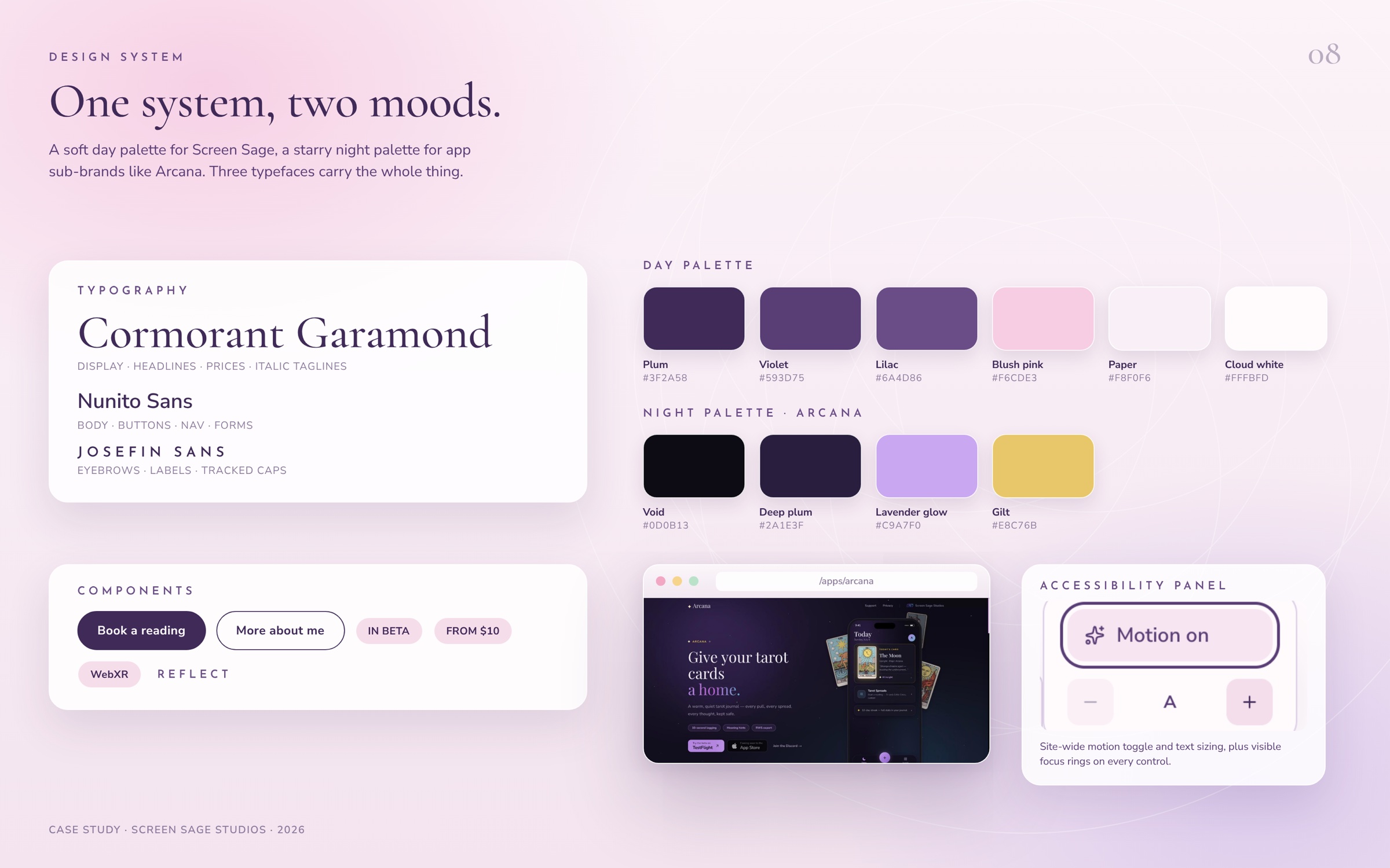
one system, two moods
The visual language is a sanctuary first and a storefront second. A blush-to-lilac gradient, a faint flower-of-life lattice behind the hero, floating hearts, sparkles and soft cloud banks at the bottom of each page all say “you can rest here.” The dark plum buttons and crisp white cards say “and this is a real business.”
Typography
| Face | Used for | Why |
|---|---|---|
| Cormorant Garamond (500, italic 500) | Headlines, prices, taglines like “You belong here, fellow seeker.” | An old-style serif gives tarot and philosophy their gravity, and the oldstyle numerals make $10 and $25–50 feel hand-lettered |
| Nunito Sans (400 to 700) | Body, nav, buttons, forms | Rounded terminals keep the serif from feeling austere; very legible at 13 to 17 px |
| Josefin Sans (600, 0.3em tracking, caps) | Eyebrows and labels: WATCH, REFLECT, HOW IT WORKS | A geometric label face creates a third voice for wayfinding without adding color |
Color
The day palette runs from Plum #3F2A58 (text, primary buttons) through Violet #593D75 and Lilac #6A4D86 (secondary text, eyebrows) to Blush pink #F6CDE3 and Paper #F8F0F6 (backgrounds). Cards are near-white at 95 percent opacity with a 1 px white border and 22 px radius, so they float over the gradient instead of cutting it.
App sub-brands flip to a night palette. The Arcana page at /apps/arcana uses a void of #0D0B13, a starfield, deep plum glows, lavender text and gilt accents, with Rider-Waite-Smith card art. The two moods share the same type stack and spacing, which is what keeps them reading as one studio.
DAY PALETTE
Plum#3F2A58Violet#593D75Lilac#6A4D86Blush#F6CDE3Paper#F8F0F6NIGHT PALETTE · ARCANA
Void#0D0B13Deep plum#2A1E3FLavender glow#C9A7F0Gilt#E8C76BMotion and sections
Sections fade and lift into view on scroll. A persistent accessibility button lets any visitor switch motion off and step text size up or down, and every control carries a visible focus ring (the double ring on “Book a live reading” in the screenshots is the real keyboard focus state).
Components
Pill buttons (dark fill for primary, 1.5 px outline for secondary), status pills (In beta, From $10, WebXR), eyebrow labels, numbered “How it works” steps, pricing cards with a check-list, and a single modal shell used for both booking and the project form.
FEATURE DEEP DIVES
built, not bolted on
Tarot commerce and the native booking calendar
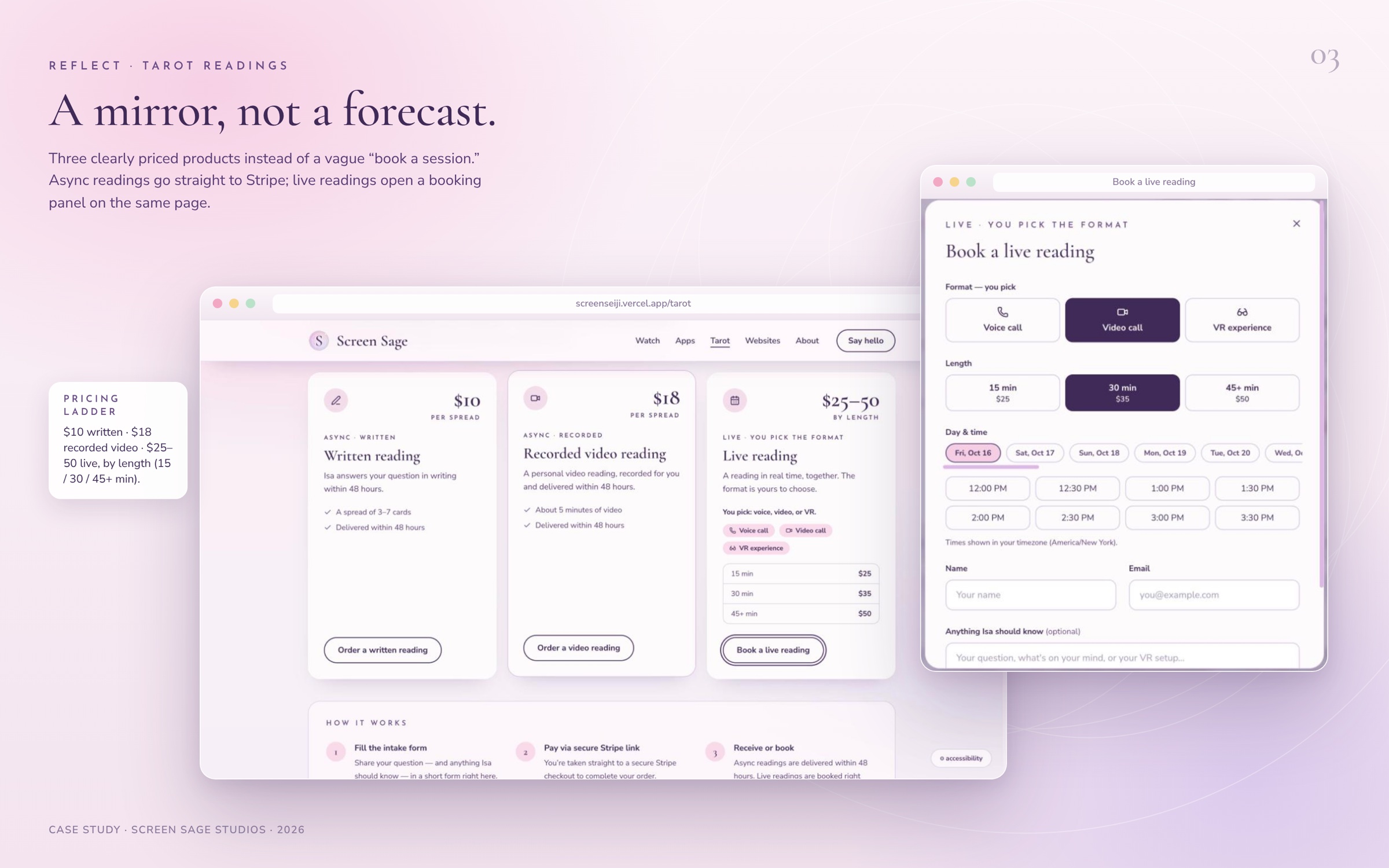
The tarot page turns a fuzzy service into three products. Written reading, $10 per spread of 3 to 7 cards, delivered within 48 hours. Recorded video reading, $18, about five minutes of video, same turnaround. Live reading, $25 for 15 minutes, $35 for 30, $50 for 45 or more, by voice call, video call or VR.
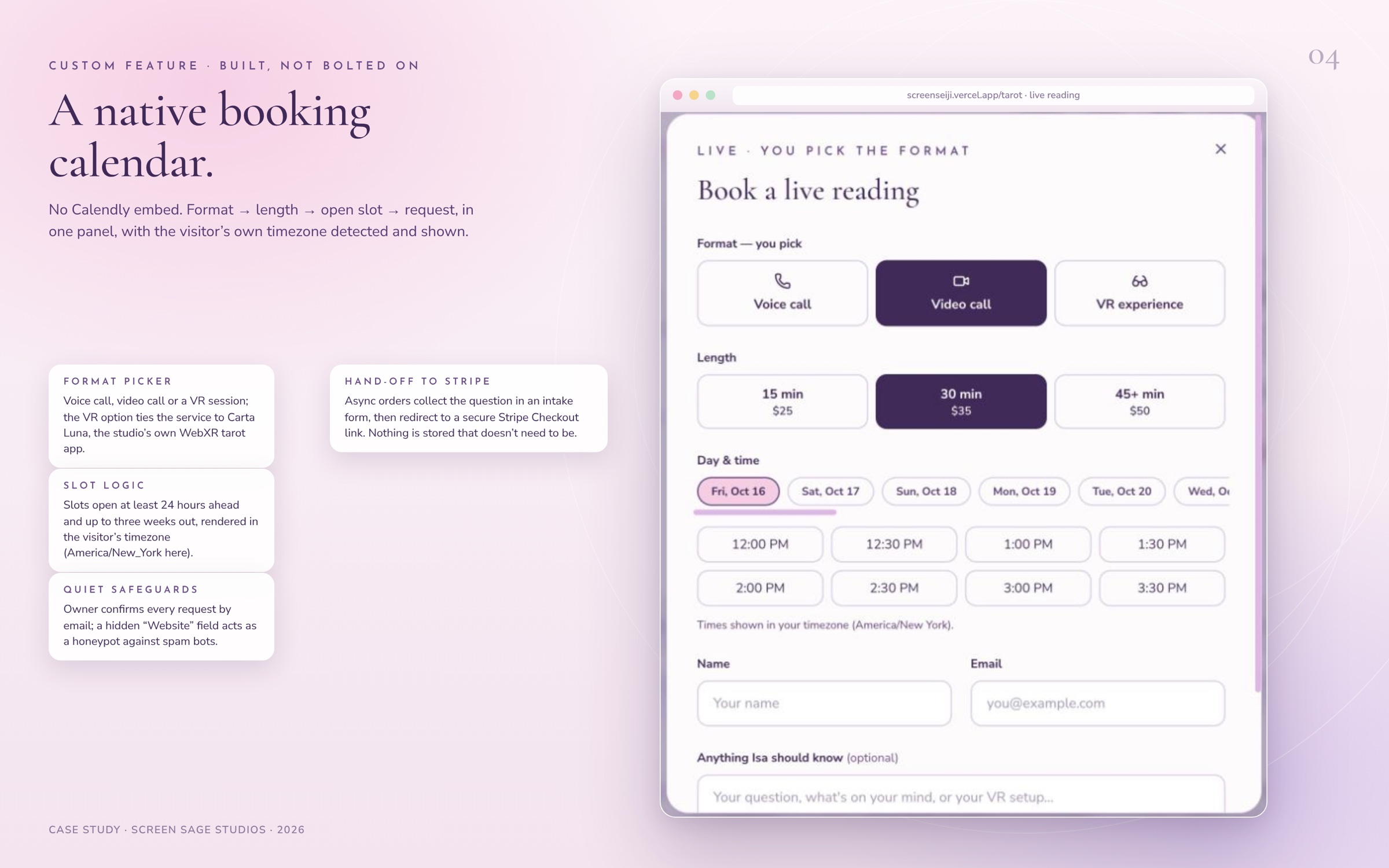
Async orders open an intake form (name, email, question, anything Isa should know) and then redirect to Stripe Checkout. Live readings open a booking panel built from scratch: pick a format, pick a length, and a strip of day chips plus a grid of 30-minute slots appears, rendered in the visitor’s own timezone with the zone named on screen. Slots open at least 24 hours ahead and up to three weeks out. The owner confirms each request by email, which keeps a human in the loop without a calendar integration to babysit. A hidden “Website” field acts as a honeypot against form spam.
The VR option is not a gimmick. It links the service to Carta Luna, the studio’s own WebXR tarot table, and the FAQ on the page explains the difference between a live VR reading with Isa and reading for yourself in Carta Luna.
The App Universe
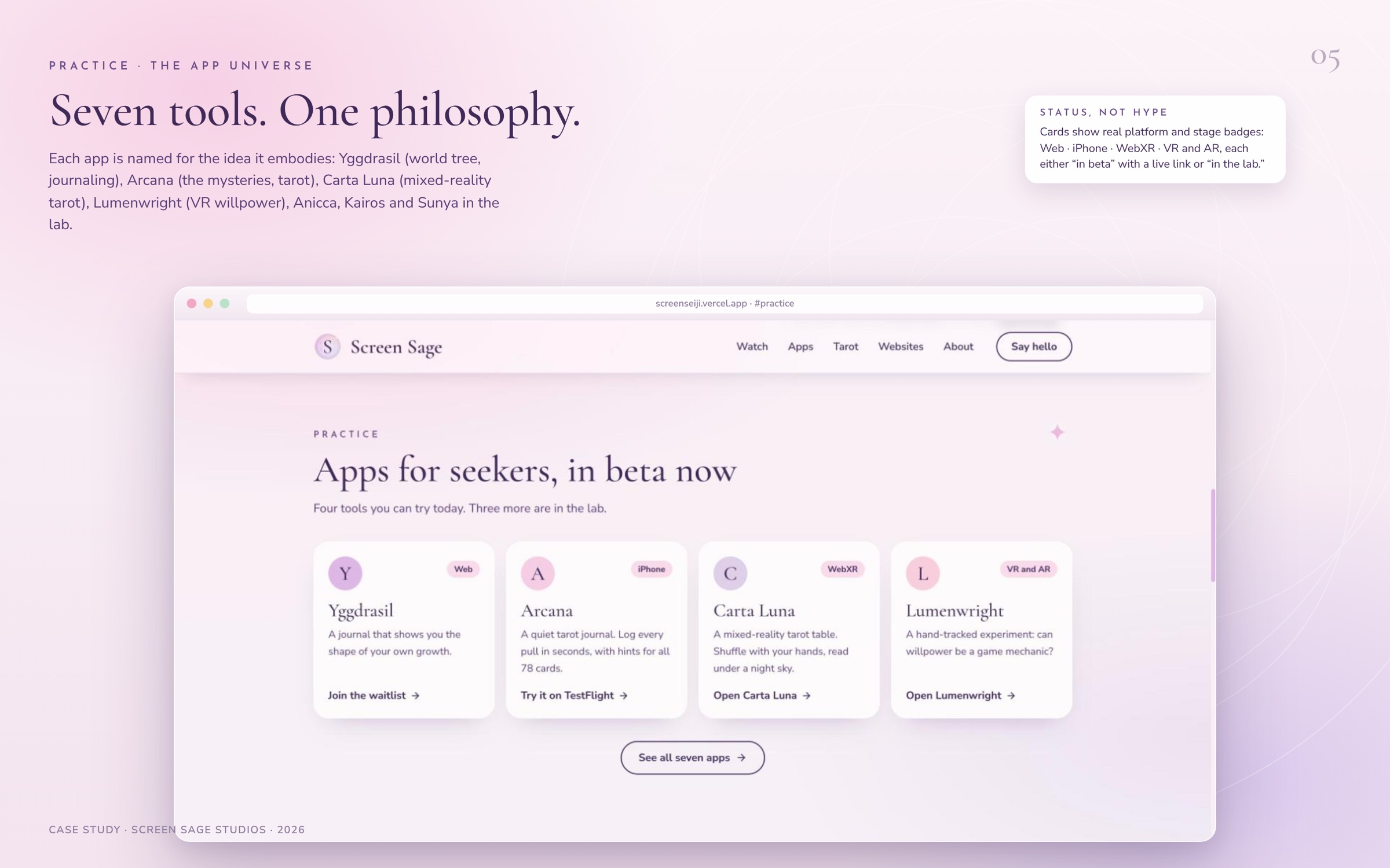
Seven apps, each named for the concept it embodies, each tagged with a real platform and a real stage. Yggdrasil (Norse world tree, AI journaling, web, beta with waitlist). Arcana (the mysteries, iOS tarot journal, public TestFlight). Carta Luna (card of the moon, mixed-reality tarot, WebXR and Meta Quest). Lumenwright (maker of light, hand-tracked VR and AR). Anicca, Kairos and Sunya are marked “in the lab” rather than hidden, which sets expectations and still shows range. Arcana gets a full product page with App Store style feature sections, support and privacy routes, and its own dark theme.
Side Quests and the build-log calendar
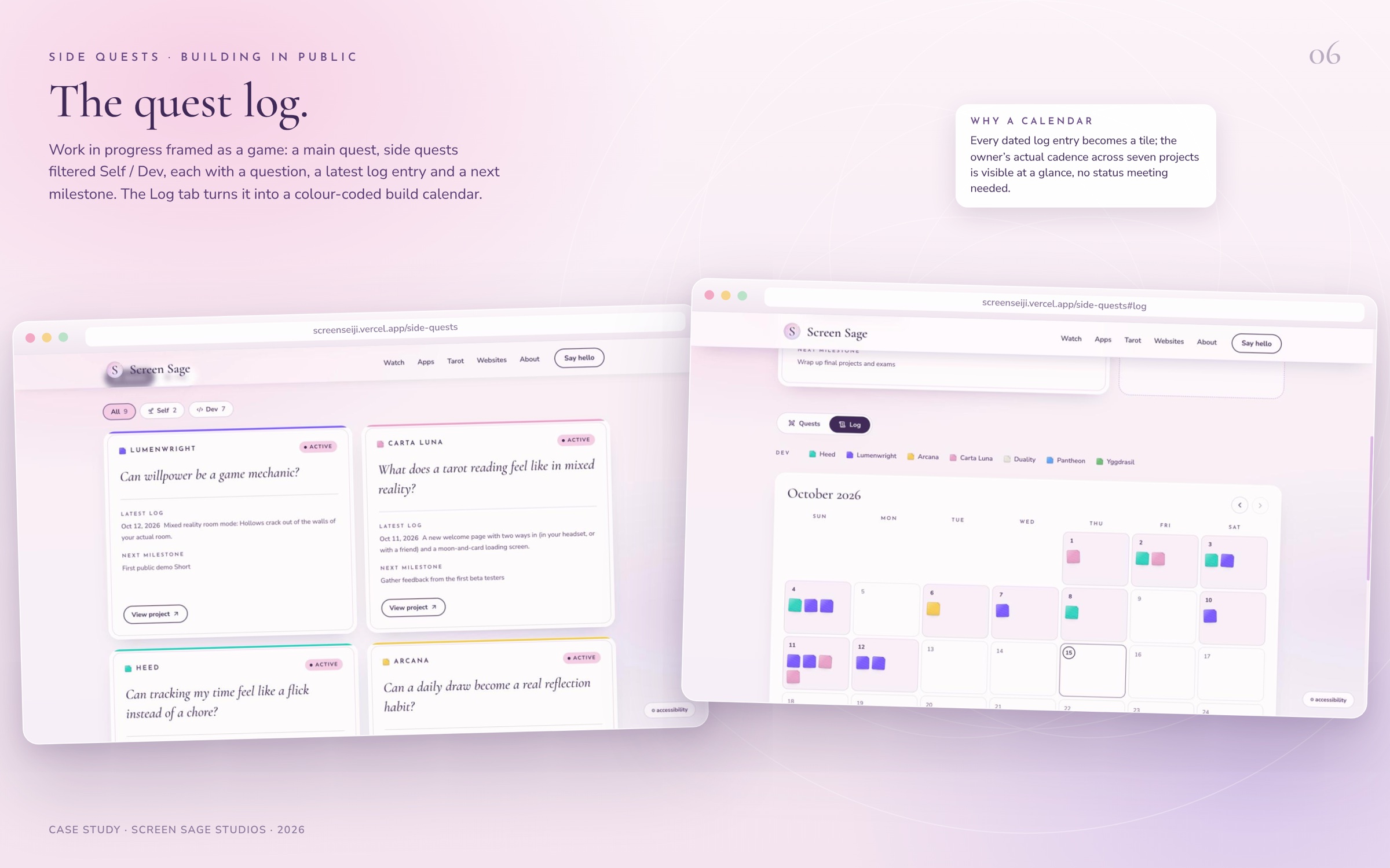
A public quest log reframes work in progress as a game. A main quest (Graduation Sprint, target Nov 3, 2026) sits on top with a countdown and next milestone. Nine quests below filter by Self (2) or Dev (7), each framed as a question (“Can willpower be a game mechanic?”), with a dated latest log and a next milestone. A Log tab flips the same data into a month calendar where every dated entry becomes a colour-coded tile per project, so the owner’s real cadence across seven projects is visible without a status meeting.
The websites studio and project form
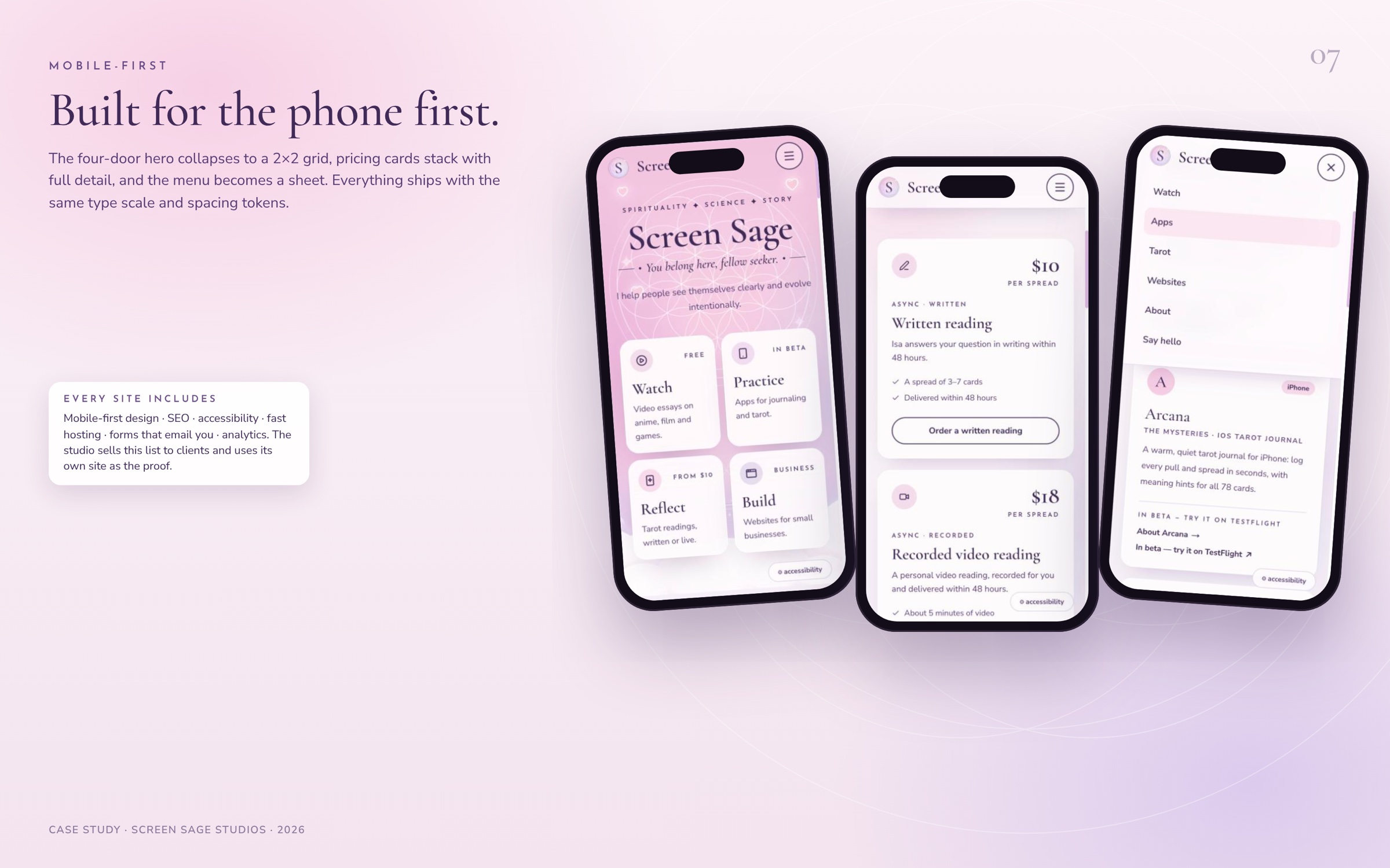
The Build door sells three tiers (landing page, business website, custom features) and a flat promise that every site includes mobile-first design, SEO, accessibility, fast hosting, forms that email you and analytics. The project form asks for name, email, optional business and current site, then project type, budget range (under $1,000 to $5,000+) and timeline from dropdowns, and a free-text brief. Two minutes, no commitment, and a quote comes back by email. The FAQ answers price, SEO and redesign questions before they are asked.
Contact, mailing list and the social graph
A single contact form with a topic dropdown (general, tarot inquiry, collaboration, client project) routes every kind of message through one place. A mailing list block (“Join the journey”) sits between Meet Isa and Contact. The footer and the Find Me section link every channel under one handle, @screenseiji, across YouTube, TikTok, Instagram, Threads, X, Discord, Spotify, Apple Podcasts, Gumroad and Ko-fi.
THOUGHT PROCESS
the decisions that shaped it
Sort by intent, not by content type. An earlier framing of the site led with the philosophy (0 = 1 = ∞) and listed media, tarot, software and gaming as four vehicles for the same idea. That is true, but it makes a first-time visitor read an essay before they find the thing they came for. The live site keeps the philosophy (it is still on the About page, with the three expandable glyphs for Nothingness, the Self and Everything) and moves the verbs to the top. Watch, Practice, Reflect, Build are things a person does, so they self-sort in one glance.
Price everything. Tarot is a market full of “DM me for rates.” Putting $10, $18 and $25–50 on the page in a 52 px serif was a deliberate trust move, and the same instinct shows up in the project form’s budget dropdown. Nobody has to ask what it costs.
Build the booking flow instead of embedding one. A Calendly or Acuity embed would have taken an afternoon. Building it took longer but keeps the whole flow inside the brand, lets the owner confirm by email rather than auto-booking, supports a VR format no scheduling tool knows about, and becomes a feature to sell to website clients. The site itself is the demo.
Show status honestly. Three of the seven apps are “in the lab.” They are listed anyway, with no fake links. The quest log goes further and publishes next milestones and dated logs. For a solo builder, building in public is both marketing and accountability.
One system, two moods. Rather than a single dark “mystical” theme, the main site is light and soft so that payments and client work feel safe, while app pages like Arcana go dark where the product itself is a night-time ritual. Shared type and spacing keep them related.
Accessibility as a visible feature, not a footnote. The motion toggle and text sizing live in a button on every page. Focus states are obvious. The Websites page lists accessibility as something every client site includes, so the main site has to prove it.
Trade-offs accepted. The YouTube section renders a placeholder until the embed loads, which is a small cost for avoiding a heavy third-party script on first paint. Scroll-reveal animation looks lovely but needs the motion toggle to be honest. The hamburger menu on mobile is a full sheet rather than a compact dropdown, trading density for touch targets.
UNDER THE HOOD
how it's built
| Layer | What is there | Evidence on the live site |
|---|---|---|
| Framework and hosting | Next.js App Router on Vercel, next/font for self-hosted type, next/image for the mark and card art | /_next/image and font CSS variable classes on the root element; theme-color meta per route |
| Payments | Stripe Checkout links for written and video readings | “Pay via secure Stripe link” in the tarot flow and FAQ |
| Scheduling | Custom booking panel: format, length, day chips, 30-minute slot grid, timezone detection, 24-hour lead time, 3-week window | Visible in the Book a live reading modal |
| Forms | Contact, mailing list, tarot intake, live booking, project inquiry, all email-backed; honeypot field for spam | “Website” field hidden in every form |
| SEO | Per-route titles and descriptions, canonical URLs, Open Graph and Twitter cards with generated 1200×630 images, Google site verification, robots and googlebot directives, sitemap and structured data promised to clients | Route metadata on /, /tarot, /apps, /websites, /side-quests, /about, /apps/arcana |
| Accessibility | Motion toggle, text sizing, visible focus rings, semantic headings, labelled form fields | Floating accessibility button on every page |
| Analytics and support | Google Analytics, Ko-fi widget, Discord community link | Footer and widget overlay |
| Content | Quest log and build calendar driven by dated entries per project; app registry shared between home, /apps and Side Quests | The same seven apps appear with consistent names, taglines and status across three surfaces |
A note on the booking logic for anyone implementing something similar: generating slots client-side from a fixed availability window and a lead-time rule, then sending a request for the owner to confirm, is far simpler than two-way calendar sync and fails gracefully. The cost is one manual confirmation per booking, which at this volume is the right trade.
OUTCOMES
what's next
What the site has already done is visible on the site itself. Arcana went to public TestFlight on Oct 6, 2026 with the App Store launch as the next milestone. Carta Luna shipped a new welcome flow on Oct 11 and is gathering first beta feedback. Lumenwright added a mixed-reality room mode on Oct 12. Heed has a first standalone build running. The Formless Guide shipped as the first client site. Every one of those is logged publicly in Side Quests, which is the point: the site is a working studio, not a brochure.
Next on the roadmap, as the site states it: Yggdrasil beta opens to the waitlist, Arcana launches on the App Store, the Gumroad store adds the Tarot Spread Reference Guide and a wallpaper pack, and the print shop reopens.